15 times a singular letter or number led a brand to success

The logo is a graphical representation of a brand that allows people to clearly and immediately identify the company. For designers, the logo is an ambitious challenge where aesthetics must both be able to stand the test of time while reflecting the personality of the brand. Numerous studies have shown that a well executed logo can have a positive effect on the perception of a business, while a poor logo can have a devastating impact.

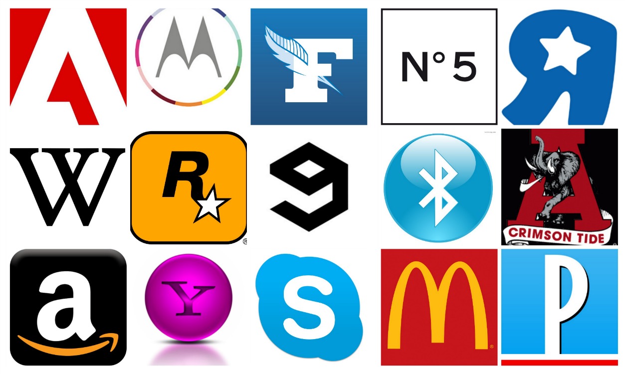
In this article, we’ll look at companies that have managed to stand out by designing a logo based on a single number or letter. What is their secret? Summarized in three words: color, shape and font. Each of these criteria are equally important when it comes to transmitting the values and mission of a company.

A. Adobe

The Adobe logo was designed by Marva Warnock, graphic designer and wife of the founder of the company. The “A” is composed of an unfinished triangle, giving an impression of movement because the viewers’ minds seek to complete the triangular shape.

A. Amazon

Amazon’s logo has a double meaning, firstly it attempts to convey the idea of customer satisfaction with the arrow shaped smile while also pushing the wide range of Amazon’s products with the arrow moving “from A to Z.”

A. Alabama Crimson Tide

The elephant on this football team logo is a reference to how in the 30s, the team was characterized by the media as “powerful, strong, fast and aggressive like an elephant.” Within the logo, the beast comes interacts with the letter “A” of the University of Alabama as if it is defending its school.

B. Bentley

Bentley named after its founder, Walter Owen Bentley, who founded the company in January 1919. Bentley’s logo is a B, framed by a pair of wings in reference to Mr. Bentley’s aerospace business during the first World War.

B. Bluetooth

The name “Bluetooth” is directly inspired by the Anglicized nickname of the Danish king Harald Blåtand (Harald the Bluetooth in English). The Bluetooth logo is also inspired by the original runic alphabet of the name Harald Blåtand: (Hagall) (ᚼ) and (Bjarkan) (ᛒ).

M. McDonald

McDonald’s logo is based on two criteria: color and shape. The colour and the shape reference the famous yellow color of the McDonald’s fries, while the two arches under which the consumer can find shelter and eat. In some European countries, the chain has recently changed its red background to a green one, symbolizing its investment in sustainable development.

M. Motorola

For over a year, the Motorola mobile brand has been a part of Google. Until recently, the company has always branded itself with its famous logo, a white, stylized M in a red circle. The new logo references the past executions, while using trendy pastel colours to bring the logo into today’s age.

P-F. “Le Parisien” and “Le Figaro”

Let’s focus on two logos of popular French newspapers. Le Figaro is one of the oldest French newspapers still in publication. The stylized feather quill pen pierces the letter “F” therefore referencing the press and the newspaper’s history, while Le Parisien uses the colours of the French flag to represent its national identity. The designers have chosen to integrate the color blue in both logos to symbolize truth and wisdom.

R. Rockstar Games

Rockstar Games is a developer and game publisher. Its logo is the famous R * on yellow-orange background. However, the background color changes for each studio owned by the company. For example, Rockstar San Diego has a logo with a purple background.

S. Skype

Skype’s logo is in blue and white. The colour blue was chosen to make the viewer think of communication as well as other existing social networking sites such as Twitter, Faceboook and Tumblr. The cloud shape is the company’s visual connection to their service as people from around the world are connected through the ‘air.’

R. Toys R Us

The logo uses A Cyrillic “Я” to represent the word “are.” The elimination of the quotation marks and star, coupled with the expansion of R and addition of a subtle color adjustment recently helped modernize the logo.

W. Wikipedia

Wikipedia’s logo uses the typeface Linux Libertine which reference 19th century books. Like the famous site, Linux Libertine is also a free font open for public use.

Y. Yahoo!

The word “Yahoo” comes from the book “Gulliver’s Travel” and is a reference to a person physically repulsive but whose actions are extraordinary. Yahoo’s founders chose this name because they considered themselves as “yahoos.” This story comes to explain the adventurous nature of the logo which is accompanied by an exclamation mark and the colour purple. In marketing, this colour is usually a double-edged sword because the public seems to either like it or radically hate it.

5. Chanel N°5

Coco Chanel drew the bottle of the famous perfume herself. She wanted a simple design because the perfume should remain the most important aspect of the product. In the logo, we find elements that fuse her desire for class and aesthetic. The black color symbolizes the mystery and the elegance of the fragrance. The number 5 is distinguished by its simplicity and refers to the fragrance’s launch date during the 5th month of the year.

9. 9Gag

9gag’s logo originates fact from the sites’s conception, as each page contained nine publications. This is no longer the case with the establishment of continuous, almost constant user generated content. The shape of the logo’s character can be interpreted as either a cube-like number nine or a reverse letter ‘G,’ forcing the viewer to make subliminal connections.

10 tasty restaurant websites for your inspiration