Of course the Apple brand succeeded. Ubiquitous among designers and a great deal of smartphone zombies owners, the elegant and simple logo, backed by an inspired vision and a history of brilliant product design helped the Cupertino-based company establish itself as one of the biggest corporations of any kind. But can something as in-your-face and figurative as a fruit can drive a brand by itself? What kind of values can it convey to make a product of service the best thing since the invention of sliced bread? Can the flagship of your company’s image really be something you eat, lest it withers in a week or so? Apparently, yes…
cursor


Beyond the Apple logo (or 10 fruit logos who succeeded in life nevertheless)
1. Blackberry
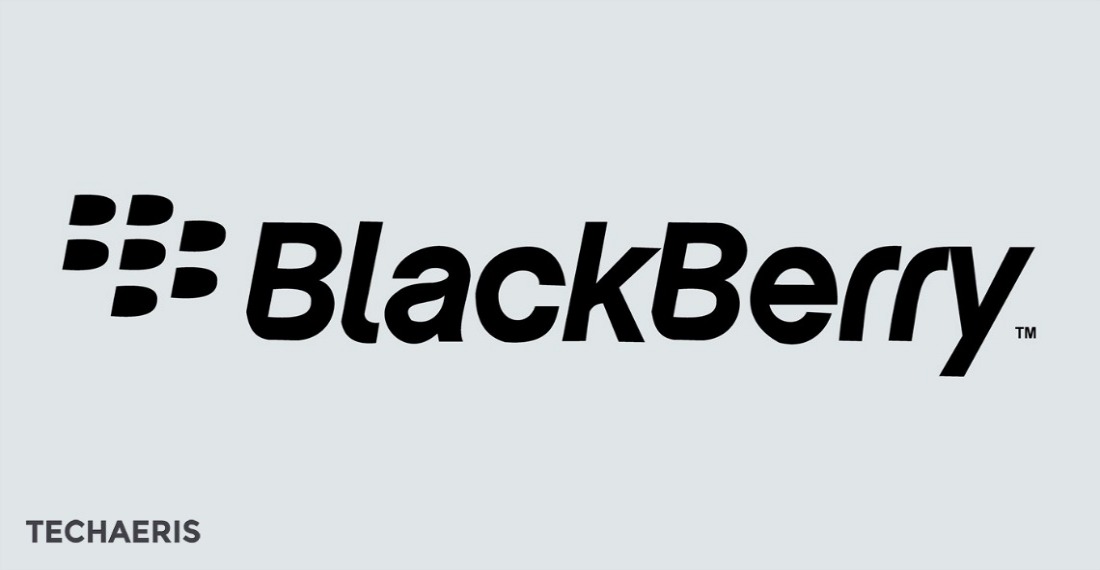
I don’t want to make an ordered list, but this one, with its use of typographic negative space to actually create the brand name’s symbol, would sit pretty high on it.
2. Fresh
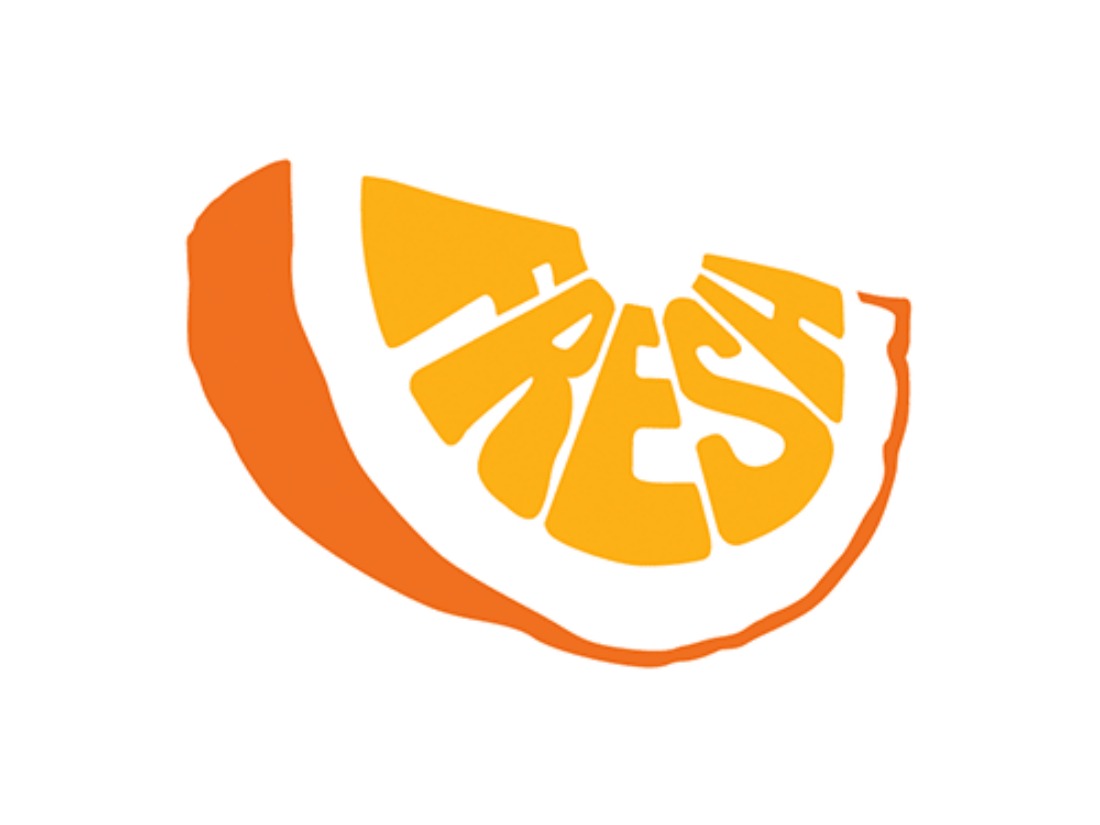
Simple, vibrant and eloquent; Really conveys its core value by the letter design and the colors.
3. juicy Films

This unused concept for a production company makes good use of the fruit’s inner patterns to serve its ends.
4. Chérie Hairspa

Oh, you’re such a peach to put this stock logo up for sale; this being said, the idea is interesting.
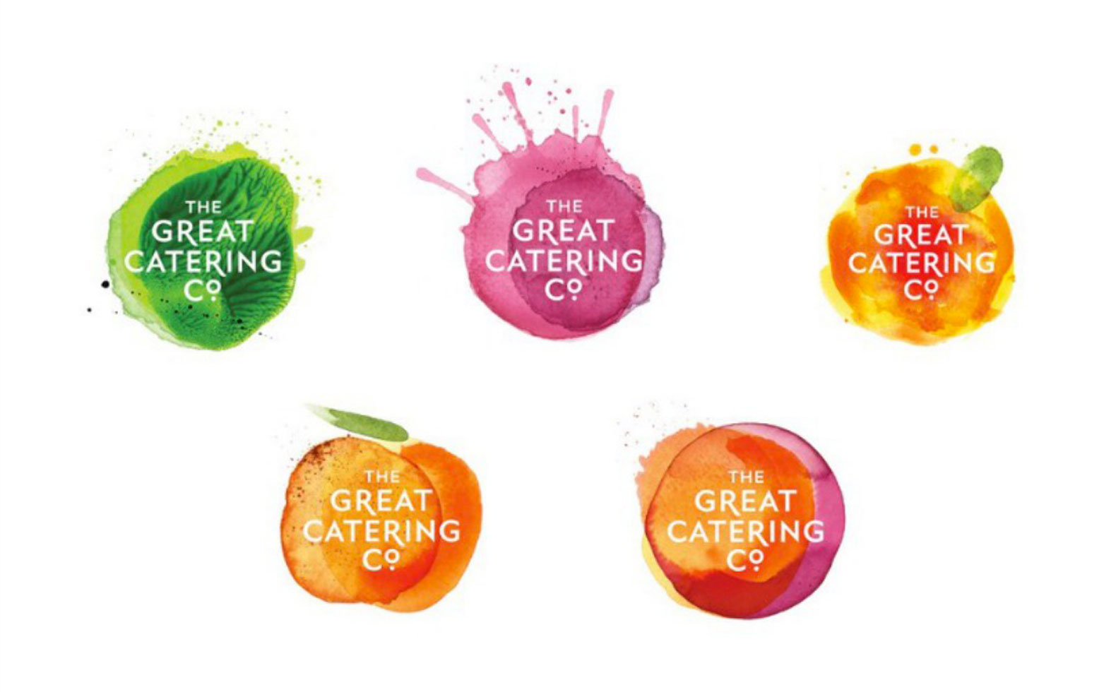
5. The Great Catering Company
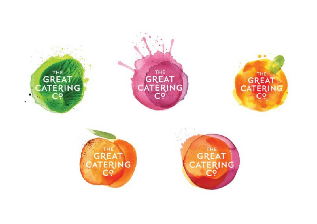
Great, great use of watercolour; a bit tricky for reproduction issues, but the human and organic fresh touch absolutely nails it.
6. Annana
Finesse and lightness, yet the fine and steady lines convey a great deal of professionalism.
7. Orange Investments
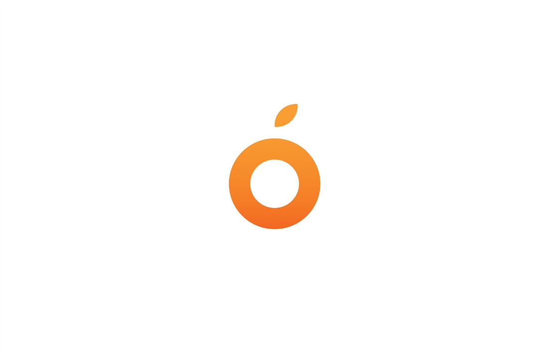
Structurally very, very simple but hey, it works; great thing the Agency kept the branding minimal and didn’t screw it up.
10. ...or just add a leaf to any symbol so that it becomes a fruit, apparently.